The objective of this project was to research and develop a rebranded visual identity that represented both the company mission and values of Innovate Marquette Smart Zone as well as the community of Marquette, Michigan.
Role
Branding
Design
Creative Direction
Conceptualization
Origin of the idea
We wanted to look to the roots of the term “inspiration”. What is more inspirational than the night sky?
The Aurora Borealis/North Star represents guidance and the correspondence between man, nature, and science/technology dating back thousands of years.
We needed to meet the community of Marquette, Michigan halfway in both our messaging, outreach, and visual presence. We wanted to avoid rushing the development of the city and risk a misunderstanding and misrepresentation of the company. This is a down-to-earth way to inspire them to seek innovation as a community
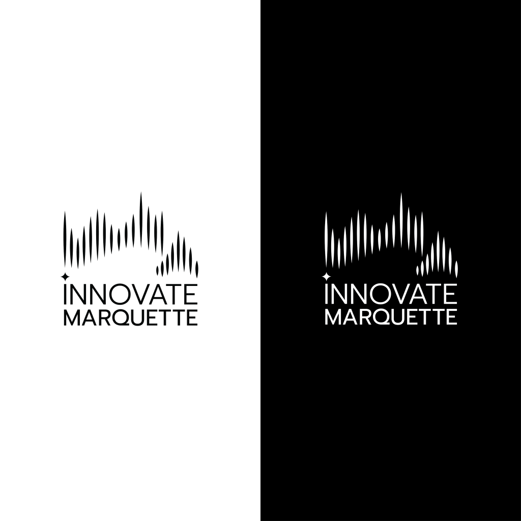
Logo
ideation
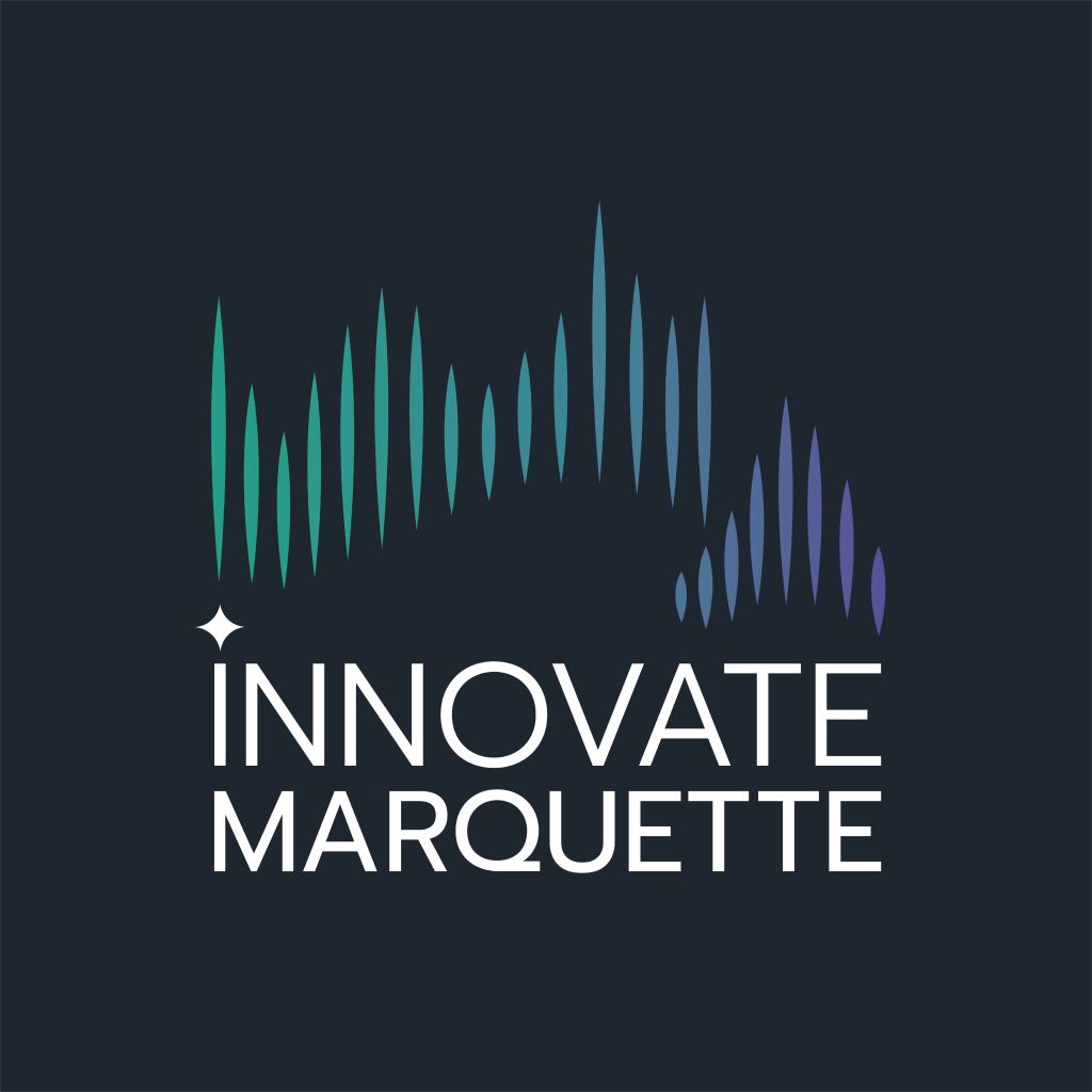
Our objective was to represent a sort of natural vibe but also hone in on the Marquette area. With the Northern lights being such a unique part of the Upper Peninsula of Michigan, it represented what we were trying to convey.
The bright greens and purple represent the current landscape in tech culture logos. However, unlike other tech logos, the colors don’t overpower the design and offer a subtle and natural spin on the neon colors typically seen.
Abstract, wave-like gradient logos have become common in tech, so using a combination of that technique with the northern lights spin, offers the collaboration of the two realms in a softer way that the community can relate to.

")